


If you’ve ever wished for a more user-friendly way to input colors in Flotiq — beyond the classic hex code typing struggle — this article is for you. I’ll walk you through building a custom plugin in Flotiq that lets users pick colors from a palette instead of hunting for hex codes like they’re Pokémon. Grab your keyboard (and maybe a coffee), and let’s dive into some React-based plugin magic, told straight from the trenches.


Dalia Bachmatiuk is a Frontend Developer at Flotiq. Holding an engineering degree in Biomedical Engineering with a specialization in Medical Informatics. Beyond her work in web development, she is passionate about aerial arts - including silks, hoops, and pole dance. She also enjoys crocheting and is an enthusiastic gamer, especially fond of platformers and roguelike games.

In our project, we needed a way for users to input colors into a Flotiq text field — without requiring them to be fluent in HTML or hex code sorcery. Let’s face it: not everyone is a developer or designer, and asking someone to type #FF5733 correctly is a recipe for frustration. So we thought: "What if picking a color was as easy as clicking a button?"
Spoiler alert: it's possible.

First, we went on a quest for a color picker library and found the mighty react-color. It was flexible, full-featured, and didn’t require a blood sacrifice to configure.
Knowing the plugin needed React, I grabbed the official Flotiq React plugin template: flotiq-ui-plugin-templates-react. A solid starting point.
To get things rolling (you can listen to Adele, while reading this article), I added an input of type "color" to every text field named "color". I reviewed the list of Flotiq plugin events and found the one I needed to manage field configuration.
I began by creating a new file in src/field-config/index.js with a function to change the input type:
export const handleFieldConfig = ({ name, properties, config }) => {
  if (name !== 'color' || properties?.inputType !== 'text') return;
  config.type = 'color';
};
Then, I registered this function in src/index.js and cleaned up the template code:
import pluginInfo from './plugin-manifest.json';
import { handleFieldConfig } from './field-config';
import { registerFn } from './plugin-helpers';

registerFn(pluginInfo, (handler) => {
  handler.on('flotiq.form.field::config', (data) => handleFieldConfig(data));
});
But it looked... meh.
So I decided to style the input. Because if you can’t make it functional, at least make it fabulous.
Since I couldn’t style the Flotiq input directly, I styled it using a custom class. In handleFieldConfig function i pass custom class to the input (src/field-config/index.js) :
export const handleFieldConfig = ({ name, properties, config }) => {
  if (name !== 'color' || properties.inputType !== 'text') return;
  config.type = 'color';
  config.additionalInputClasses = "plugin-color-picker-input"
};
I added styles to src/styles/index.css:
.plugin-color-picker-input {
  width: 100px;
  background-color: white;
}
And passed my custom styles into Flotiq UI (src/index.js):
import pluginInfo from './plugin-manifest.json';
import { handleFieldConfig } from './field-config';
import { registerFn } from './plugin-helpers';

import cssString from '!!css-loader?{"sourceMap":false,"exportType":"string"}!./styles/index.css';

registerFn(pluginInfo, (handler) => {
  if (!document.getElementById(`${pluginInfo.id}-styles`)) {
    const style = document.createElement('style');
    style.id = `${pluginInfo.id}-styles`;
    style.textContent = cssString;
    document.head.appendChild(style);
  }

  handler.on('flotiq.form.field::config', (data) =>
    handleFieldConfig(data),
  );
});
The result? A plugin that’s 80% done, 90% fabulous and 100% proud.
We needed more than just a basic picker — we wanted opacity control and the ability to type in a color. So I added the react-color library and created a new component in src/field-config/ColorPicker.js.
Fun fact: the library doesn't support opacity in hex colors, so we had to manually convert alpha values to hex. Because why not add a little math to your day?
import { useCallback } from 'react';
import { ChromePicker } from 'react-color';

/**
 * Converts alpha (0-1) to 2-digit hex
 * Due to https://github.com/casesandberg/react-color/issues/416,
 * we need to manually convert aplha to hex
 */
const alphaToHex = (alpha) => {
  const hex = Math.round(alpha * 255)
    .toString(16)
    .padStart(2, '0');
  return hex;
};

const ColorPicker = ({ name, value, form }) => {
  const onChange = useCallback(
    (color) => {
      let hexColor = color.hex;
      if (typeof color.rgb?.a === 'number' && color.rgb.a < 1) {
        hexColor += alphaToHex(color.rgb.a);
      }
      form.setFieldValue(name, hexColor);
    },
    [form, name],
  );

  return <ChromePicker color={value} onChange={onChange} />;
};

export default ColorPicker;
I updated the src/field-config/index.js file to pass my newly created Color Picker to the input.
import ReactDOM from 'react-dom/client';
import { addElementToCache, getCachedElement } from '../plugin-helpers';
import ColorPicker from './ColorPicker';

const updateApp = (root, data) => {
  root.render(<ColorPicker {...data} />);
};

const initApp = (div, data) => {
  const root = ReactDOM.createRoot(div);
  updateApp(root, data);
  return root;
};

export const handleFieldConfig = (data) => {
  const { contentType, formUniqueKey, name, config, properties } = data;

  if (name !== 'color' || properties.inputType !== 'text') return;

  const key = `${contentType.name}-${formUniqueKey}-${name}`;
  let cachedApp = getCachedElement(key);

  if (!cachedApp) {
    const div = document.createElement('div');
    addElementToCache(div, initApp(div, data), key);
  } else {
    updateApp(cachedApp.root, data);
  }

  config.additionalElements = [getCachedElement(key).element];

  // I removed the styles for the input, but left the class as it will be useful in the next steps for styling
  config.additionalInputClasses = "plugin-color-picker-input"

  // I wanted the input to have placeholder that will indicate the input is color selector
  config.placeholder = 'Select color';
};
I wanted the color picker to open only when the user clicked the color button or focused on the input. So I added some logic to handle that. It’s like a secret door — only opens when you know the trick.
I changed the file src/field-config/ColorPicker.js:
import { useCallback, useEffect, useRef, useState } from 'react';
import { ChromePicker } from 'react-color';

/**
 * Converts alpha (0-1) to 2-digit hex
 * Due to https://github.com/casesandberg/react-color/issues/416,
 * we need to manually convert aplha to hex
 */
const alphaToHex = (alpha) => {
  const hex = Math.round(alpha * 255)
    .toString(16)
    .padStart(2, '0');
  return hex;
};

const ColorPicker = ({ name, value, form }) => {
  const ref = useRef();
  const [open, setOpen] = useState(false);

  const onChange = useCallback(
    (color) => {
      let hexColor = color.hex;
      if (typeof color.rgb?.a === 'number' && color.rgb.a < 1) {
        hexColor += alphaToHex(color.rgb.a);
      }
      form.setFieldValue(name, hexColor);
    },
    [form, name],
  );

  const toggleOpen = useCallback(() => {
    setOpen((open) => !open);
  }, []);

  useEffect(() => {
    const handleClickOutside = (event) => {
      if (event.target?.className?.includes?.('plugin-color-picker-input')) {
        setOpen(true);
      }

      if (!ref.current) return;
      const inputContainer =
        ref.current.parentElement?.parentElement?.parentElement;

      if (
        (inputContainer && !inputContainer.contains(event.target)) ||
        (!inputContainer && !ref.current.contains(event.target))
      ) {
        setOpen(false);
      }
    };

    document.addEventListener('mousedown', handleClickOutside);

    return () => {
      document.removeEventListener('mousedown', handleClickOutside);
    };
  }, []);

  return (
    <>
      <button
        type="button"
        onClick={toggleOpen}
        ref={ref}
      >
        <div
          style={{
            background: value || '#ffffff',
            height: '16px',
            width: '32px',
            border: '1px solid #8ea1b8',
          }}
        />
      </button>
      <div style={open ? {} : { display: 'none' }}>
        <ChromePicker color={value} onChange={onChange} />
      </div>
    </>
  );
};

export default ColorPicker;
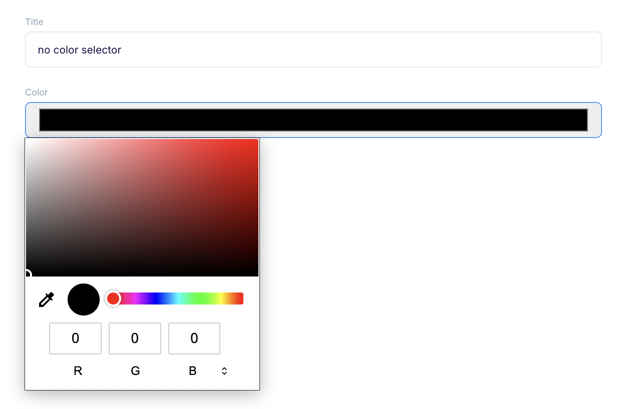
The result:
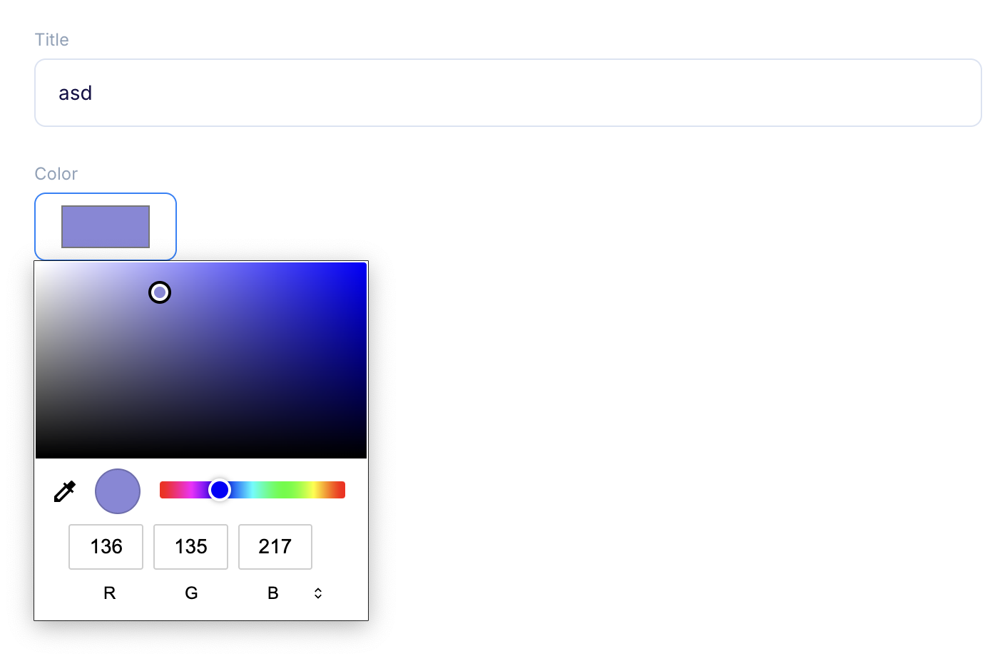
Now for the glam. I wanted the input to show a color swatch and a background that indicates transparency.
I changed the ColorPicker (src/field-config/ColorPicker.js) content to:
import { useCallback, useEffect, useRef, useState } from 'react';
import { ChromePicker } from 'react-color';

const ColorPicker = ({ name, value, form }) => {
  // component logic
  return (
    <>
      <button
        className={`plugin-color-picker-pick-button ${open ? 'plugin-color-picker-pick-button--opened' : ''}`}
        type="button"
        onClick={toggleOpen}
        ref={ref}
      >
        <div className="plugin-color-picker-swatch-bg"></div>
        <div
          className={`plugin-color-picker-swatch ${!value ? 'plugin-color-picker-swatch--empty' : ''}`}
          style={{ background: value || '#ffffff' }}
        />
      </button>
      <div className="plugin-color-picker-picker">
        <ChromePicker color={value} onChange={onChange} />
      </div>
    </>
  );
};

export default ColorPicker;
Then, I updated the styles in src/styles.index.css:
.plugin-color-picker-input {
  padding-left: 56px;
}

.plugin-color-picker-pick-button {
  position: absolute;
  left: 16px;
  top: 38px;
}

div:has(> label.hidden) + div .plugin-color-picker-pick-button {
  top: 16px;
}

.plugin-color-picker-pick-button > div {
  height: 16px;
  width: 32px;
  border: 1px solid #8ea1b8;
}

.plugin-color-picker-picker {
  position: absolute;
  z-index: 100;
  display: none;
}

.plugin-color-picker-pick-button--opened + .plugin-color-picker-picker {
  display: block;
}

.plugin-color-picker-swatch-bg,
.plugin-color-picker-swatch {
  position: absolute;
  inset: 0px;
}

.plugin-color-picker-swatch-bg {
  background: url('data:image/png;base64,iVBORw0KGgoAAAANSUhEUgAAABAAAAAQCAYAAAAf8/9hAAAAPUlEQVR4AeySywkAMAhDH52h+0/YIRoH8IMnD0JyCgSe5gA3sWJfVuCnhWQLYMYNnr4VOdzJDAQR9LUI8AEAAP//ViLpiAAAAAZJREFUAwBk7gjBheCOvgAAAABJRU5ErkJggg==')
    left center;
}

.plugin-color-picker-swatch--empty::after,
.plugin-color-picker-swatch--empty::before {
  content: '';
  display: block;
  content: '';
  width: 100%;
  height: 1px;
  background: #8ea1b8;
  transform: skewY(25deg);
  position: absolute;
  top: 50%;
  left: 0;
}

.plugin-color-picker-swatch--empty::before {
  transform: skewY(-25deg);
}
The result? A sleek, stylish color picker that even a designer would nod at approvingly.
Phew! We built a color picker. It works. It’s beautiful. But now comes the hard part — managing plugin settings.
I didn’t want the picker to show up on every field named "color". That would be chaos. So I built a schema to let users choose which fields should have the picker.
I used the flotiq.plugins.manage::form-schema event to dynamically build the settings form. No manual styling needed — Flotiq handles that for us. Thanks, Flotiq. You’re my hero.
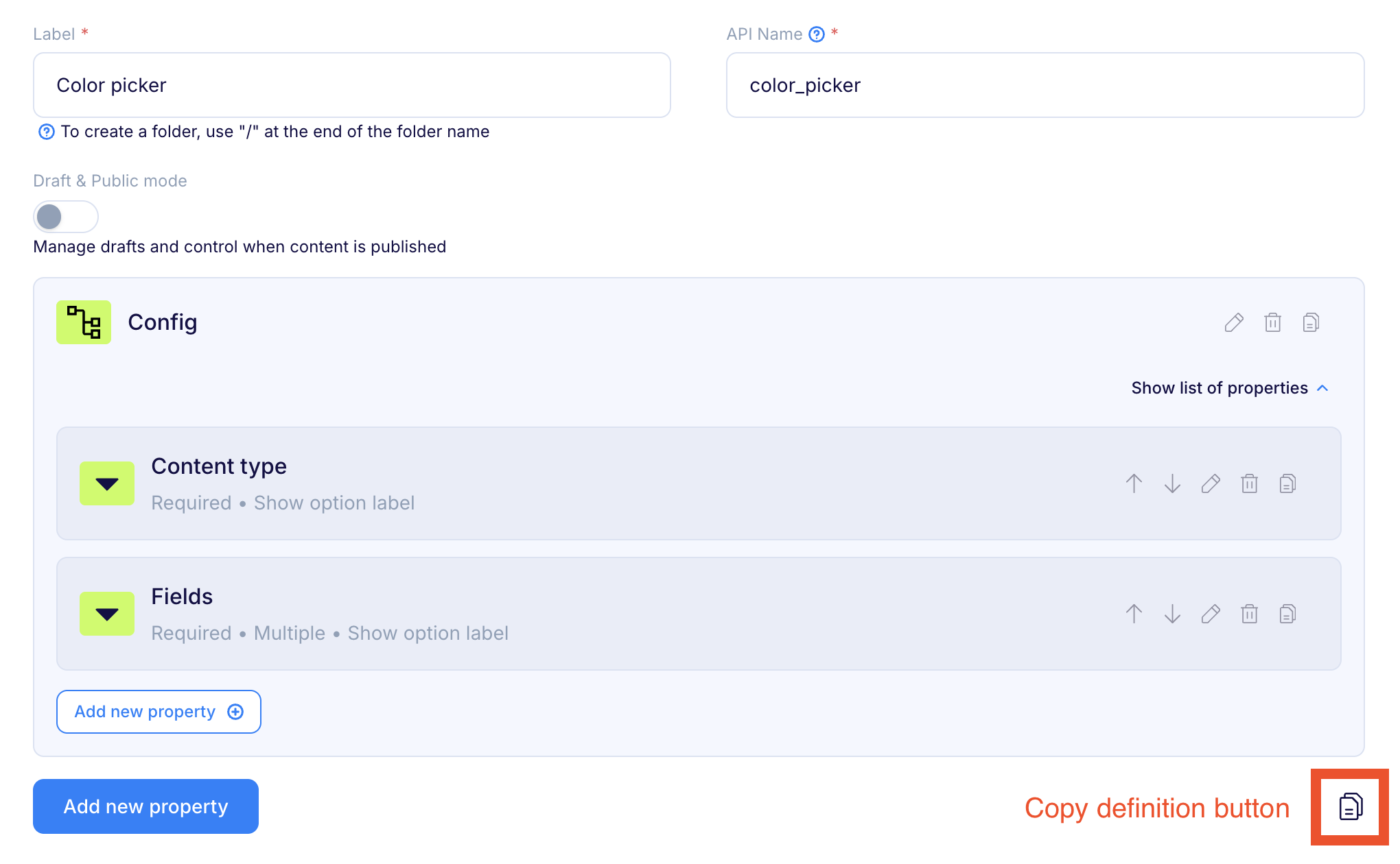
In Flotiq’s editor, I crafted the settings UI for the plugin — basically, the controls for what fields the color picker will work with.
I passed the schema definition to the event handler (src/manage-form/index.js):
import pluginInfo from '../plugin-manifest.json';

export const handleManageForm = () => {
  return {
    schema: {
      id: pluginInfo.id,
      name: pluginInfo.name,
      label: 'Color picker',
      draftPublic: false,
      internal: false,
      schemaDefinition: <GENERATED-SCHEMA>
      metaDefinition: <GENERATED-META>
    }
  }
};
Then, I registered my new event handler in src/index.js.
This gave me the first working version of the plugin settings modal:
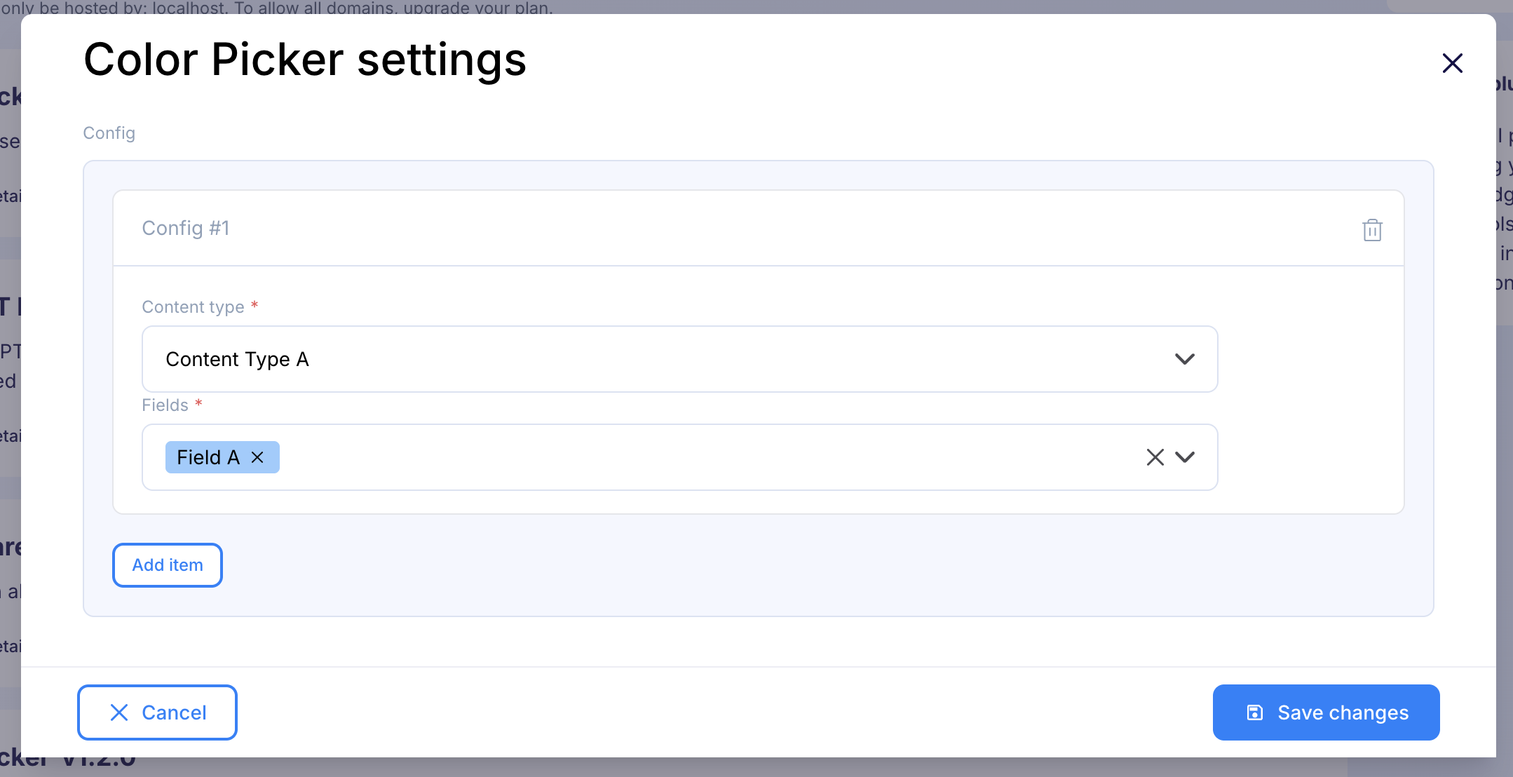
Users needed to select a Content Type and then pick text fields from that type. We don't want them to remember all the field and content type names, so let's give them a list that allows only selecting from existing Content types. Once Content Type is selected, populate dropdown with the fields that belong to that Content Type and can be supported by color picker.
So I:
I changed the file src/manage-form/index.js:
import pluginInfo from '../plugin-manifest.json';

export const handleManageForm = ({ contentTypes }) => {
  const ctds = contentTypes
    ?.filter(({ internal }) => !internal)
    .map(({ name, label }) => ({ value: name, label }));

  return {
    schema: {
      id: pluginInfo.id,
      name: pluginInfo.name,
      label: 'Color picker',
      draftPublic: false,
      internal: false,
      // ...previous schemaDefinition
      metaDefinition: {
        // ...previous metaDefinition
        content_type: {
          label: 'Content type',
          unique: false,
          helpText: '',
          inputType: 'select',
          optionsWithLabels: ctds,
          useOptionsWithLabels: true,
        },
      }
    }
  }
};
To clear selected fields when the Content Type changes, I used the flotiq.form.field.listeners::add event.
I created new file in src/field-listeners/index.js:
import pluginInfo from '../plugin-manifest.json';

export const handleFormFieldListenersAdd = ({ contentType, name, form }) => {
  if (contentType?.nonCtdSchema && contentType?.id === pluginInfo.id && name) {
    const { index, type } =
      name.match(/config\[(?<index>\d+)\].(?<type>\w+)/)?.groups || {};

    if (index == null || !type) return;

    if (type === 'content_type') {
      return {
        onChange: () => {
          form.setFieldValue(`config[${index}].fields`, []);
        },
      };
    }
  }
};
I also created a utility to extract valid fields from Content Types. I wanted to save options by field key but show them in the UI using user-defined labels. So I created a function that returns fieldKeys for validation and fieldOptions for the dropdown (src/manage-form/lib/valid-fields.js).
import pluginInfo from '../../plugin-manifest.json';

export const validInputTypes = ['text', 'simpleList'];

const findValidFields = (
  properties,
  fields,
  fieldKeys,
  parentKey = '',
  parentLabel = '',
) => {
  Object.entries(properties || {}).forEach(([key, value]) => {
    const inputType = value?.inputType;
    const fieldConfig = value;
    const fieldKey = parentKey ? `${parentKey}.${key}` : key;
    const fieldLabel = parentLabel
      ? `${parentLabel} > ${fieldConfig.label || fieldKey}`
      : fieldConfig.label;

    if (inputType === 'object') {
      findValidFields(
        fieldConfig.items.propertiesConfig,
        fields,
        fieldKeys,
        fieldKey,
        fieldLabel,
      );
    }
    if (validInputTypes.includes(inputType)) {
      fields.push({ value: fieldKey, label: fieldLabel });
      fieldKeys.push(fieldKey);
    }
  });
};

export const getValidFields = (contentTypes) => {
  const fields = {};
  const fieldKeys = {};

  contentTypes
    ?.filter(({ internal }) => !internal)
    .map(({ name, label }) => ({ value: name, label }));

  (contentTypes || []).forEach(({ name, metaDefinition }) => {
    fields[name] = [];
    fieldKeys[name] = [];

    findValidFields(
      metaDefinition?.propertiesConfig,
      fields[name],
      fieldKeys[name],
    );
  });

  return { fields, fieldKeys };
};

export const validFieldsCacheKey = `${pluginInfo.id}-form-valid-fields`;
Then I added code to the src/field-config/index.js for overriding options passed to dropdown:
import pluginInfo from '../plugin-manifest.json';
import ReactDOM from 'react-dom/client';
import { addElementToCache, getCachedElement } from '../plugin-helpers';
import ColorPicker from './ColorPicker';
import { validFieldsCacheKey } from '../manage-form/lib/valid-fields';

export const handleFieldConfig = (data) => {
  const { contentType, form, formUniqueKey, name, config, properties, form } = data;

  /**
   * Pass new options only when content type
   * has id equal to plugin and is only plugin settings deifinition
   */
  if (contentType?.id === pluginInfo.id && contentType?.nonCtdSchema) {
    const { index, type } =
      name.match(/config\[(?<index>\d+)\].(?<type>\w+)/)?.groups || {};

    if (index == null || !type) return;

    if (type === 'fields') {
      const { fields } = getCachedElement(validFieldsCacheKey);
      // Get currently selected content type
      const ctd = form.getValue(`config[${index}].content_type`);
      config.options = fields?.[ctd] || [];
    }
    return;
  }

  // the input color picker logic
};
Then I created a validator in src/manage-form/lib/validator.js to ensure only valid fields are selectable:
export const getValidator = (fieldKeys) => {
  const onValidate = (values) => {
    const errors = {};

    values.config?.forEach(({ content_type, fields }, index) => {
      if (!content_type) {
        errors[`config[${index}].content_type`] = 'Field is required';
      }

      if (!fields?.length) {
        errors[`config[${index}].fields`] = 'Field is required';
      } else if (
        (fields || []).filter(
          (field) => (fieldKeys[content_type] || []).indexOf(field) < 0,
        ).length > 0
      ) {
        errors[`config[${index}].fields`] = "One of the fields doesn't exist";
      }
    });

    return errors;
  };

  return onValidate;
};
I moved the schema to src/manage-form/lib/schema.js and cached it avoid regenerating it unnecessarily and cleared it when the modal closed:
import pluginInfo from '../plugin-manifest.json';
import {
  addObjectToCache,
  getCachedElement,
  removeObjectFromCache,
} from '../plugin-helpers';
import { getValidFields, validFieldsCacheKey } from './lib/valid-fields';
import { getValidator } from './lib/validator';
import { getSchema } from './lib/schema';

export const handleManageForm = (data) => {
  const { contentTypes, modalInstance } = data;

  const formSchemaCacheKey = `${pluginInfo.id}-form-schema`;
  let formSchema = getCachedElement(formSchemaCacheKey);

  if (!formSchema) {
    const validFields = getValidFields(contentTypes);
    addObjectToCache(validFieldsCacheKey, validFields);

    const ctds = contentTypes
      ?.filter(({ internal }) => !internal)
      .map(({ name, label }) => ({ value: name, label }));

    formSchema = {
      options: {
        disabledBuildInValidation: true,
        onValidate: getValidator(validFields.fieldKeys),
      },
      schema: getSchema(ctds),
    };
  }

  modalInstance.promise.then(() => removeObjectFromCache(formSchemaCacheKey));

  return formSchema;
};
I build my final version of plugin settings manage modal!
The last step: showing the color picker for selected fields (src/field-config/index.js):
import pluginInfo from '../plugin-manifest.json';
import ReactDOM from 'react-dom/client';
import { addElementToCache, getCachedElement } from '../plugin-helpers';
import ColorPicker from './ColorPicker';
import { validFieldsCacheKey } from '../manage-form/lib/valid-fields';

export const handleFieldConfig = (data, { getPluginSettings }) => {
  // the plugin settings field config logic

  const pluginSettings = getPluginSettings();
  const parsedSettings = JSON.parse(pluginSettings || '{}');

  if (!contentType || properties?.inputType !== 'text') return;

  const contentTypeSettings = parsedSettings?.config?.filter(
    ({ content_type }) => content_type === contentType.name,
  );

  if (
    !contentTypeSettings?.length ||
    contentTypeSettings.filter(({ fields }) =>
      fields.includes(name.replace(/\[\d+\]/g, '')),
    ).length === 0
  )
    return;

  // the color picker logic
};
In src/index.js, I passed Flotiq globals to the event:
import pluginInfo from './plugin-manifest.json';
import { handleFieldConfig } from './field-config';
import { registerFn } from './plugin-helpers';

import cssString from '!!css-loader?{"sourceMap":false,"exportType":"string"}!./styles/index.css';

registerFn(pluginInfo, (handler, _client, globals) => {
  if (!document.getElementById(`${pluginInfo.id}-styles`)) {
    const style = document.createElement('style');
    style.id = `${pluginInfo.id}-styles`;
    style.textContent = cssString;
    document.head.appendChild(style);
  }

  handler.on('flotiq.form.field::config', (data) =>
    handleFieldConfig(data, globals),
  );
});
After testing, I had a working plugin that:
In later versions, I added:
Curious about these features? Check out the source code or join us on Discord. We might just make a part two!
Not a React fan? No worries. Flotiq also offers a plugin template for plain JavaScript: flotiq-ui-plugin-templates-plain-js. It’s perfect when you don’t need fancy hooks — just good old-fashioned logic.
Creating custom plugins in Flotiq opens up a world of tailored content management. With a bit of React (or plain JS) and a sprinkle of curiosity, you can solve real user problems — like making color input a breeze.
This journey proves that plugin development isn’t just for the elite few — it’s a creative process where every step teaches you something new. So go ahead, experiment, and make your projects shine (literally, if you use neon colors).
Happy coding! 🎉


 Hint
Hint