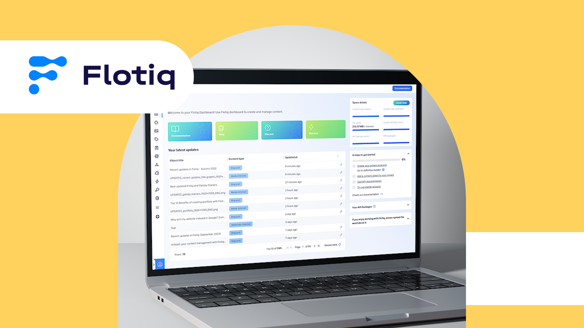
In this post, we want to take a sneak peek at what is waiting for you. Let us know what you think about it!
We’re a team of passionate developers dedicated to building innovative solutions and sharing our knowledge. From coding best practices to emerging tech trends, we explore it all. Our goal is to simplify complex concepts and empower developers of all levels. Join us as we learn, build, and grow together!
.png)
Over the last few months, we have been working on a major redesign of the user experience in Flotiq.
Flotiq’s current user interface has been created several years ago and has received a few updates in the meantime. We believe it is time to move to a more modern design, like our main page, which we changed in December 2021 along with the new brand identity. We already updated the UI to match the new branding, but we wanted to take it a step further, so all the elements fit perfectly.
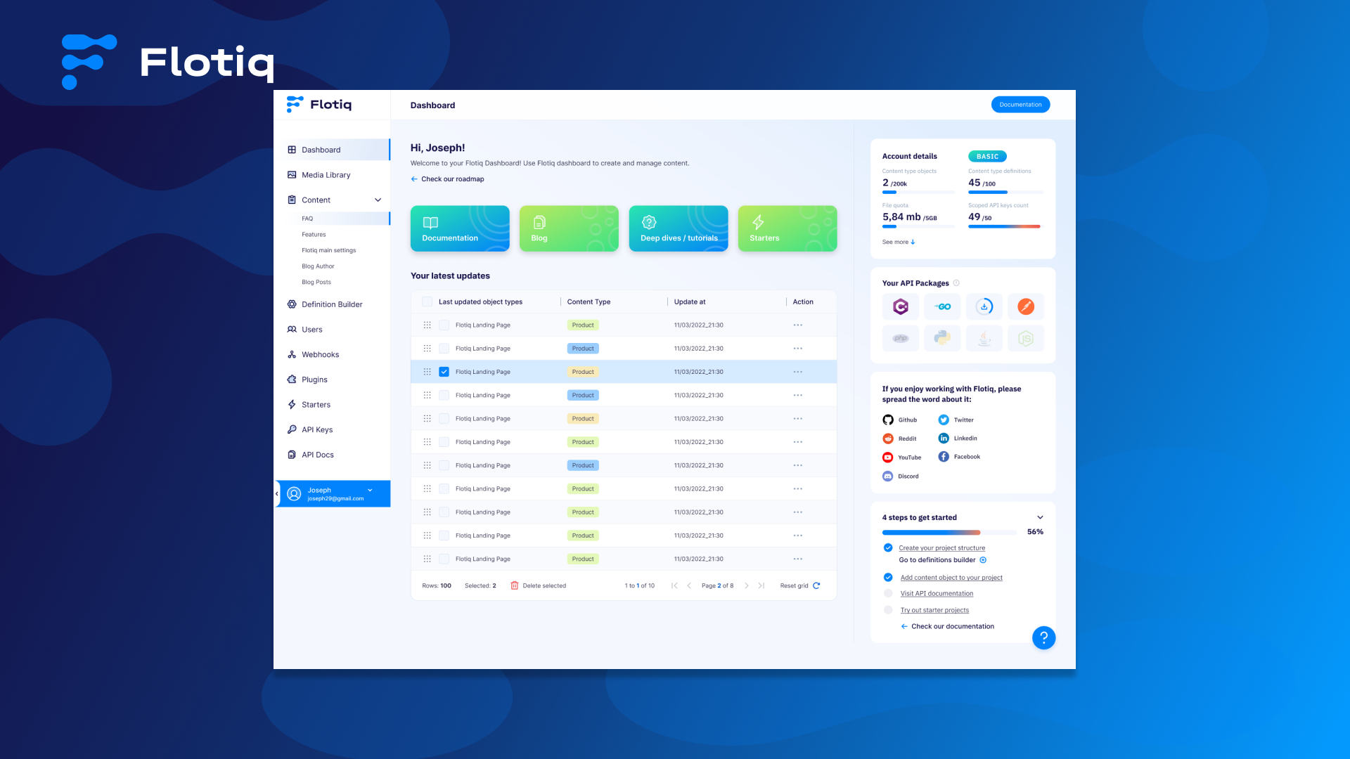
Starting from the welcome screen – our dashboard is receiving a ton of updates: fresh colors, more useful informational panels across the entire view and the use of shapes and gradients that is consistent with our brand.
This page also offers quick access to the documentation, blog, tutorials and our social media if you want to check company news or share the project you're working on with us.
Also, you can see your limits without going to the setting page, so keep an eye on it!
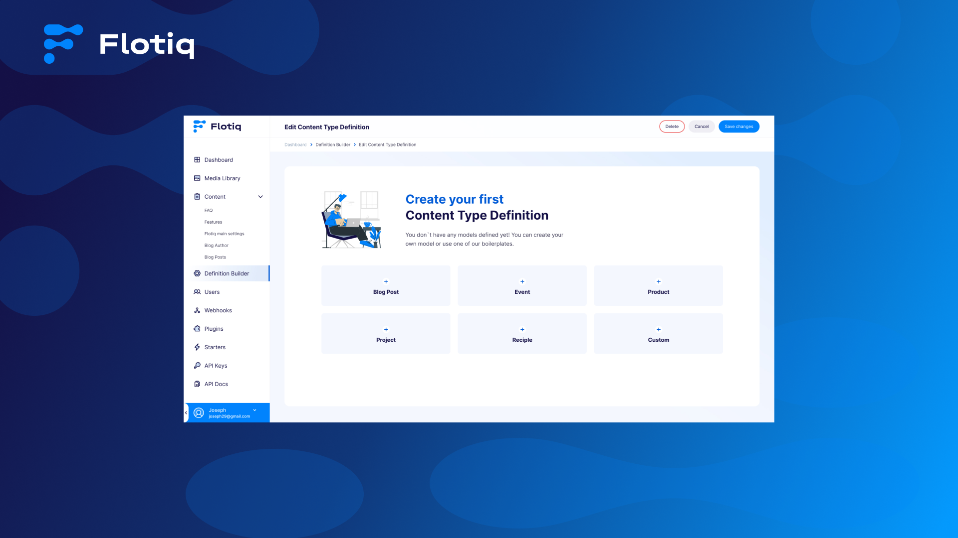
Arguably - the most important part of Flotiq – the CTD builder has received a lot of attention too. We are introducing a new empty state screen to help you start:
And we completely redesigned the tiled view – showing more relevant information about the content types that you have and making it easier to work with them.
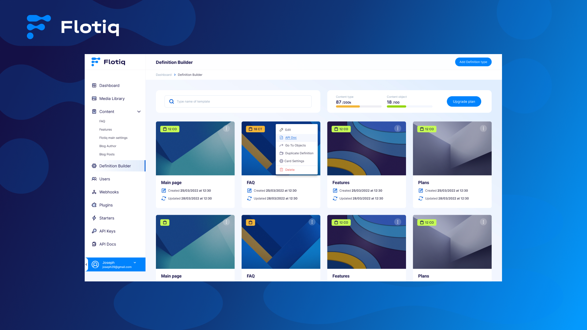
The content-type property editor has been given an interface overhaul to lighten the user experience and allow you to focus on what is important during development.
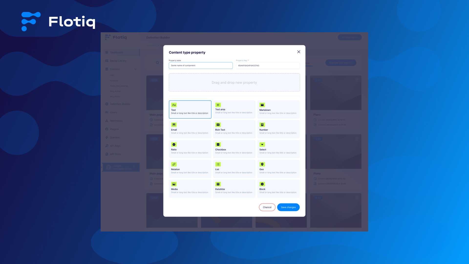
The builder now has a more effortless flow, so you will have more comfort during the project creation.
This is only part of the changes we prepared for you. Stay tuned to see more updates!
And let us know what you think at hello@flotiq.com
We will be happy to get feedback from you.